Monday, January 28, 2008

Coulda Woulda Shoulda

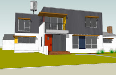
One thing that is a bit intimidating about designing our own house and being architects, is that we don’t want to make any mistakes - we’re not perfect; and we know whatever we do here will require us to live with it for a long time to come. If it was someone else’s design, we could write it off as someone else’s poor planning on their part. Not so in this case. Architects tend to be critical perfectionists and we are often our own worst clients.

This weekend, as we were checking out the framing going up at the house, we made the realization that we may regret one of our cost-cutting decisions. In our quest to take a sizable chunk of money out of the project, we reduced the dining room space by 6 feet. Because our 1st and 2nd floor align, this also reduced the size of the upper floor, thus saving us quite a bit of money (theoretically). We tested the plan with several furniture layouts and thought it was workable and felt right on paper. But as we were looking at the framed-in area, well, the dining room seems downright tiny. This, we must warn you, is a typical reaction of nearly everyone who builds a home – “Oh, it seems smaller than I thought it would.” Yet even armed with this knowledge, it turns out we were not immune. View thru living room to kitchen subflooring. The dining room is to the right of kitchen.

The dining room seemed on the small side. We measured the space and checked the plans just to make sure there wasn’t a mistake made in the field. Nope, it was built as per our plans. At the time, I think we made the right decision - our money tree isn’t that large. Now, we’re just trying to reconcile the fact that this new dining room will actually be smaller than the one in our existing home, which is small enough. The more we consider this, the more we think it will be okay – quality of space over quantity, you know? Or, perhaps this is just Susankian rationalization? Time will tell.

Part of sustainability is the deliberate act of minimizing one’s footprint, and doing more with less. Our dining room – and the rest our house for that matter – is designed to be just big enough and no bigger. We’ve actually designed a couple of spaces in our new home a bit smaller than we’re accustomed to and a fair shake smaller than the predominant standard in current American “give me more” housing. The reason why the smaller room will work well in our new home is that it is open to both the kitchen and living room area, so there is some flexibility in the arrangement and use of space. Each room can and will be used as part of the other from time to time. Large dinner parties just may take over not only the dining room but the living room as well.

To all our friends who expect to have a sit-down dinner at the new house - how about a buffet-style grazing around the kitchen island instead?

Friday, January 25, 2008

Magic Lighting

This week I spent a little time in New York City and experienced first hand the magic of LED lighting as used in retail spaces. LED (light emitting diode) lighting technology has been around for awhile, but hasn’t been perfected for all residential applications yet. LEDs are small in size and give a directional light, but can be grouped together for higher intensity applications. They use much less energy than incandescent or fluorescent lighting and don’t give off heat like incandescents. An LED can last up to 60,000 hours. (that translates to 6.8 years-with the light on 24 hrs/day or 20 plus years of typical use).


This Nokia store in Manhatten has translucent panels with LEDs behind them. They are programmed to change colors- from blue to red, yellow, white and green. It's almost mesmerizing enough to spend that $10,000 for a custom leather/diamond phone (NOT really- but it is a beautiful store)


The FAO Schwartz store has LEDs in the ceiling that also change colors and patterns.


In the plaza in front of the FAO store stands the Apple Store entry. It’s a minimalist glass cube with meticulously detailed round glass elevator and staircase. Like everything that Apple designs, it’s absolutely gorgeous.


Although LED seems to be the way of the future, we are a few years away from affordable, well-designed LEDs for general residential applications. Word on the street is that incandescent lights will be banned in the near future (they are already in Australia for 2009) and there will need to be viable alternatives. There has been a big emphasis on CFLs (Compact Fluorescents)- but they have some major downsides, namely light quality and the fact that they contain mercury leads to disposal issues.

As we researched lighting solutions for our new home, we started looking first at EnergyStar rated fixtures. We quickly found that the design options were very limited, they are all lamped for only fluorescent bulbs and they are a bit more expensive than a similar incandescent-lamped fixture. We decided to use standard fixtures, but switch out the bulb to CFLs for storage rooms, bedrooms and closets. In living spaces, we are using halogen fixtures on dimmers to reduce energy use and be able to tailor the lighting for various situations.

At Lappin Lighting, we were able to find a LED version of a recessed can light http://www.llfinc.com/index.aspx
It inserts into a typical housing, so it can be retrofitted or used for new installations. It is dimmable and the LED can be ordered in a white light or warmer version 2700K (what I prefer). These are about 3-4 times the cost of a standard recessed halogen model, but we are going to try 3 of these fixtures in our living area.
We were hoping to also have LED pendant fixtures for our kitchen island. Bruck http://www.brucklightingsystems.com/ is a German company that has quite a few LED light options, including some great-looking pendant lights. Although the German-quality might be worth it, our budget just can’t fit them in at the moment. We always have the option of trying a LED bulb that screws into a standard Edison socket (for about $26) http://www.theledlight.com/

Sunday, January 20, 2008

The Most Important Room(s) in the House


The bathrooms might be some of the smaller rooms in the house, but per square foot, they take the cake on design time- no question about it. The existing house has a recently remodeled full bathroom on the first level, so that has saved us some design time and money. The only work we will do in that bathroom is to replace the toilet with a dual flush Toto Aquia dual flush unit. The dual flush toilet has both a .9 gallon per flush option and a 1.6 gallon per flush option and it looks pretty sleek as well.

The upper 2 bathrooms have gone through dozens of iterations. We originally tried to salvage the existing bathroom on the upper floor. It has the original 1940’s tile and tub. This proved to be too limiting to the rest of the upper floor plan, as the existing 3’ wide corridor would prevent us from getting most of our furniture to the upper floor. Once we decided to demolish the existing bathroom, it opened up a whole series of options on bathroom arrangement for us.

The plan we settled on for the bid documents has the master bedroom toilet and shared bathroom back to back. This allows for a common plumbing wall, which is a very efficient approach. We have a compartmentalized design for the shared bath, so someone (who shall remain nameless) can spend as much time as he needs on the toilet, while others could still have access to the sink and toothbrushing. We initially had only a shower for the master bathroom and a tub/shower for the shared bathroom.


The tub/shower combination is what we have in our current house, but I wanted a better solution to the shower curtain problem. I hate having a curtain and don’t want a shower door that makes the tub impossible to clean. There doesn’t seem to be any good solutions out there, except to separate the shower and the bath. So much to Kevin’s chagrin, I reworked the shared bathroom to include a separate bath. (Men just don’t seem to appreciate the importance of a good bubble bath.) This reworking of the shared bath did result in Mazzy losing a bit of her closet space, but given the increase in size over her existing 3’ closet, I don’t think it will be a problem.

For the shared bathroom, we are going with the entire Nexus suite from Toto. We are working with Ratieken Sales in Minnetonka for both Toto and Grohe fixtures. http://www.raksales.com/ The Eco-Nexus toilet has a 1.28 gallons per minute single flush. The air bath has warm air jets that will give you a heated massage. (yeah!) I have told Kevin that once he tries our new Toto Nexus Air Bath, he will likely break down crying and thank me for insisting on it!


In the Master bathroom, we are specifying another Aquia dual flush and a Toto square vessel sink with Grohe faucets. Look for a posting soon on the exciting tile selections!

Thursday, January 17, 2008

A Good Foundation

A good foundation is important in just about everything, from the type of bread one uses for a sandwich to concrete piers. Even in spite of the bad soils we needed to deal with we have a good foundation in place now and will begin framing up walls in the next couple of days.

We had initially planned to use insulated concrete forms (ICF's) for our foundation walls - these are essentially a lightweight formwork that is made from rigid insulation, filled with steel reinforcing and concrete. It is high in insulating R Values, is easy to install and an all around great system. It can be used for whole house construction and many people do just that. We've used it as a foundation wall before on an addition to our current home and like it just swell, spanky.

So of course for this house project - we changed our minds. We needed to save a little money, and talked things over with our builder and mason, "Buck" from Buck-Crete (651-739-3160). We ended up using an 8" reinforced cmu wall with 2" of rigid insulation on each side - giving us the same r-value as the ICF's at a lower cost. And, because the foundation walls are covered up with dirt, well, we didn't feel bad about using concrete blocks. We used Masterblock cmu's - they make a nice product called Enviroblock that contains fly-ash and other recycled content that is a bit friendlier to the environment than typical concrete blocks, as the fly ash replaces some of the portland cement the mix. An added benefit is that the fly-ash (a by -product of burning coal) doesn't end up in the landfill. We save a bit on the extraction of virgin portland cement and eliminate some landfill. So now, when we're down crawling around in our crawl space, wondering where our basement went, we'll have that going for us, which is nice.

Monday, January 14, 2008

Coloring our World


Have you ever noticed that most architects wear black most of the time? Black is always in style. It’s safe and easy. It’s doesn’t take a lot of effort to coordinate black with black, or black with white, or black with grey. Black, white and grey are the colors of choice in our world. Each day, we are forced to make so many design decisions for others that when it comes to clothing, we just don’t want to be bothered. Plus, if you spill red wine on yourself it won't show too badly.

As we start to select colors for our house, we are once again, leaning towards white, greys and black. It’s not that we like a monochromatic world, it just that we want to be selective in our use of color. And then where we do use color, to make it bold.

One opportunity for some bold moves is in the kitchen. The kitchen is the center of our house, the hub and command central. For our kitchen countertops, we are going with CaesarStone quartz manufactured stone http://www.caesarstoneus.com/ from Capital Granite http://www.capitalgranite.com/. We are looking for a durable material that will look as beautiful in 20 years as it does now. Quartz composite countertops are one of the more expensive materials, but you are buying durability and ease of maintenance and they never have to be sealed. Although they have colors that look like granite, we’re tired of the granite look and are looking for something more consistent in texture and color.

The majority of the countertops will be this concrete color.


This is the bold color move for either the island or just the bar countertop, depending on how daring we feel. Who doesn’t love a name like “Apple Martini Green”? How does that look when spilled on a black shirt?

Friday, January 11, 2008

Getting Busy

It was a busy day today. I took the day off work in order to run around town and get some house project errands done. There are so many showrooms that have limited hours, with no hours on weekends or nights, that I decided the only way to get there was to take the entire day off. Up until now, I had been relying on the internet to do the majority of product selections. That can only get you so far, before you have to meet with live people and see live samples.

We met with Electrical Visions Inc. (lighting supplier), stopped by Industrial and Lappin Lighting, selected tile at the Kate-Lo showroom, went to Capital Granite to look at the CaesarStone countertop colors and a quick trip to Lowes to see their line of refrigerators all before picking the kids up from school at 2:50. Not a bad day’s work.

The masonry/concrete subcontractor was also busy today. We stopped by a noon and they were cruising on the block work.

This view above makes the addition look pretty small. We had to check the plans to assure ourselves that what we're doing is big enough. It is. It will just be a bit deceiving until the corner of the existing house is opened up.

The big yard doesn't look very big anymore, with all the construction equipment and big pile of dirt.

Thursday, January 10, 2008

Digging Holes

One day I was listening to a program on MPR where the guest was talking about he loved to dig holes in the yard when he was a little boy. In fact, he loved to dig so much that his dad had him dig a hole big enough to bury an old family car. (That is one big hole for a small boy to dig!) Many years later, he went back to his old neighborhood in LA to talk to the owners of his childhood home. Turns out, they had discovered the buried car in the back yard. They were able to sell it as an antique as it was in near-mint condition.

I thought about this buried car as we got the news from the excavator that they encountered bad soils. By the time the news got to me, the message was “construction debris was found”. This was just a classic example of what happens in the game “telephone’ where the message gets distorted the more times it’s repeated, as it wasn’t debris or even a car that they found. It was just mucky, yucky, loose clay.
The excavator had to dig out all the bad soils, so there is quite a big pile of dirt in the yard- almost big enough for a couple of old Chevys….. or at least a basement. We were planning just a crawl space but when this amount of excavation had to happen, we took a look at adding a basement. Because of the location of this space on the other side of the utility room, this space would never become more than storage or another utility-type space. (We are trying to not go overboard with storage space that will just get filled with more & more stuff). We would also have to enlarge foundation walls and add another slab. (We are trying to reduce the budget at the moment, so another add would be painful). So, no basement it is - we've ended up filling that big hole back up with compacted sand fill - dig a hole and fill it up! It's a great way to spend $8,000. We will of course keep the crawl space. It's a good place for Kevin and the kids to practice their Spiderman exercises.

Monday, January 7, 2008

Groundbreaking!


We forgot to plan the elaborate ceremony….the hardhats, the gold shovels, the tent and the speeches. We didn’t have any of that. We didn’t even have a camera for pictures! But the groundbreaking happened despite ourselves.

The mid-winter thaw happened exactly on cue. With temperatures well-above freezing, the excavation started. The insulating blankets we had put down to keep ot the frost worked wonders. The 8 - 10 inches of snow on top of them helped a lot too. When we scraped the snow and pulled the blankets, there wasn't a bit of frost in the ground. This is good. It's the middle of January for crying out loud! The numerous brick pavers came up relatively easy, so we are going to be able to stockpile them and reuse them for landscaping later.

We were only able to relish in the thought of our project starting for a few hours before Kevin got a call from our contractor about bad soils. Seems like there is construction debris in the ground where the foundations are to go. Kevin will meet at the site tomorrow with the testing company to check it out. We might need to excavate and remove the bad soils and bring in new to get the proper bearing capacity for foundations. The party is officially over and it appears that we have encountered the first problem.

The plan is for the construction project to take about 5 months, so once the foundations start going in, the project will really start to roll. We have to be ready to make a lot of decisions quickly. In order to get a good bid, we put a lot of time and energy into the drawings. But now as it’s becoming real, we have to finalize product choices. That work usually happens during our night shift- from 9 to midnight (or later!). I can’t imagine how we’d ever get this project done without around the clock internet access!

Friday, January 4, 2008

The Simple Life

When Kevin and I had our first child, a good friend of mine, Jennifer, gave us a book called “Simplify Your Life with Kids”. I remember this book being chock full of good tips on how to minimize complications by minimizing possessions and various other ideas on keeping your life simple. The book is now missing- likely hiding amongst all the stuff, things and clutter that has accumulated in our house over the past 12 years.

This idea of simple is quite popular these days. From the magazine REAL SIMPLE, to the new book “The Simple Home” by our colleague Sarah (Sally) Nettleton.
http://www.sarah-architects.com/simple-home/about-the-book.html
Sally’s concept of the simple home is not about a style, but rather about a personal approach. It’s about being discovering your own “simple” and designing your home to be true to that vision. The design of your home should be flexible, thrifty, sustainable and timeless.

I love the idea of simple, unadorned, modern, clean home. In my mind, our new home will be entirely clutterless. (Listen for the sound of Kevin laughing out loud.) No knick-knacks, bric-a-brac or any other objects worthy of such peculiar & bizarre names. We will have designed in systems to keep the clutter at bay and can relax every day in this clean, comforting, simple environment.

Okay, this is not exactly the way we live now. This is what our kitchen countertop usually looks like. I’m not saying good design can solve all of our problems, but a good purging, thoughtful storage and a commitment to simplifying things should go a long way to creating a more calming environment. We hope.